Gene expression analysis QC pipeline in R
introduction
Over my first year working in bioinformatics, I’ve developed checklist of things that I look at in every gene expression dataset I get my hands on, whether microarray, RNA-seq or proteomics. What is the distribution of genes’ expression levels? Do gene expression profiles correlate well between samples? Or with other datasets? How variable is the expression of housekeeping genes? How well do principal components capture the data? And so on.
These are steps which come after you’ve processed raw data and already have called expression levels for probes, transcripts, genes or proteins. Hence this pipeline does not include any steps involving FASTQs or BAMs for RNA-seq, nor any steps involving normalization (e.g. with plier) for microarray. For those things, the best microarray tutorial I’ve found is this, and I’m still looking for a simple, clean RNA-seq pipeline, though this wikibook is certainly a compendium.
I’m sharing these QC steps in the hopes they’ll be useful to others, as well as so that people can comment on what I’ve missed. This also includes some of my favorite R tricks, and a not-insignificant motivation for blogging about them is so that I can always find them when I need them.
example dataset
None of the datasets I’ve run this on at work are public yet, so I hunted around for a suitable public dataset to use as an example. Project GDS4145 from NCBI GEO seemed to have many of the features I was looking for. It’s a microarray dataset on human blood with 25 patients over 5 timepoints = 125 samples, with a mix of sexes, one bad sample, and a confusing relationship between gene symbols and probes. Expression levels plus metadata and Affymetrix annotations were all available to download in one place.
Raw microarray data comes in CEL format, with optical levels for many probes which need to be combined into transcripts or genes and normalized by some complicated mechanism. For Affymetrix arrays you can use plier, see this tutorial. But this dataset is in SOFT format, which is supposedly already normalized and ready to go – more on this later.
It’s weirdly difficult to extract metadata from SOFT files, so I did this manually for this dataset and put it here.
getting started
To download and unzip this example dataset on Unix, do this:
wget ftp://ftp.ncbi.nlm.nih.gov/geo/datasets/GDS4nnn/GDS4146/soft/GDS4146.soft.gz
wget ftp://ftp.ncbi.nlm.nih.gov/geo/platforms/GPLnnn/GPL97/annot/GPL97.annot.gz
wget /wp-content/uploads/2013/08/metadata.txt
gunzip *.gz
Next I fire up R and load my favorite packages: stringr for string parsing, gap for QQ plots, and sqldf for joining and aggregating tables. SQL is so much better than R for database operations, but interfacing between R and a live SQL database is somewhat laborious – sqldf gives you the best of both worlds by letting you treat R data frames as SQL tables directly in R. If you’re going to use it, you should follow SQL naming conventions with underscores in your table names and variable names instead of periods which are more commonly used in R – for instance, my_data instead of my.data. I also set a working directory and tell R not to turn strings into factors in tables I read in.
setwd('c:/sci/026rplcl/data/microarray/practice2/')

# only if you don't have these packages already:
# install.packages("stringr")
# install.packages("gap")
# install.packages("sqldf")
# install.packages("reshape")
library(stringr) # makes string splitting, indexing, regexes easier - R's base functions are quite bad at this
library(gap) # best library I've found for qq plots
library(sqldf) # for me, JOIN & GROUP BY are easier to use than R's match/merge and aggregate
library(reshape) # for converting between matrices and relational models
options(stringsAsFactors=FALSE) # so that strings stay as strings in all read.table calls
read in data
First I read in the annotation data describing each microarray probe. If you’ve ever seen an R error message like Error in scan... line 198 did not have 21 elements, chances are 90% that it was due to characters that R incorrectly interpreted as quoting or commenting characters. For instance, maybe the first column said “patient #21″ and R thought the # started a comment, thus leaving that line with only one column. quote, comment.char and skip (to remove extraneous header lines) are your friends here. Setting comment.char = '' will turn off the interpretation of any characters as comments.
Once you’ve got it read in, check the column names and table dimensions are what you expected, and create any additional columns you wanted. I find that microarray annotations, for instance, contain cytoband location but not just the chromosome by itself as one column – that can be useful, and str_extract is good for grabbing these things.
annot = read.table('GPL97.annot',quote='',comment.char='!',skip=27,sep='\t',header=TRUE)
colnames(annot) # check that the header read correctly
dim(annot) # check right number of rows and columns
annot$Chromosome = str_extract(annot$Chromosome.location,".*?[p|q]") # Chromosome by itself is often not included in annotations, but should be.
annot$Chromosome = gsub("[p|q]","",annot$Chromosome)
Next I do similarly for the expression levels themselves:
ma_raw = read.table('GDS4146.soft',skip=188,comment.char='!',header=TRUE,sep='\t')
colnames(ma_raw)
# peek at the data
ma_raw[1:5,1:5]
Note that although head() can give you a peek at the top of a data frame, for really wide tables, just looking at the upper left corner with ma_raw[1:5,1:5] can be more useful. Sometimes you also may want to check with tail() that there aren’t any extra blank lines at the bottom.
parsing metadata
In SOFT files, the metadata is included in structured comments at the top of the file. But sometimes I’ve received a dataset where the only metadata is in either the file names (e.g. names of mRNA-seq FASTQs) or column names in a table. That’s kind of annoying, especially since R is not as good at string parsing as, say, Python. But I’ve learned that sapply and strsplit can work wonders.
Suppose you had the sex of each sample in the column names, like GSM601942.M indicating that sample id GSM601942 is male, here’s what I would do:
# example of how to parse sex out of column names like GSM601942.M, if they were formatted that way
example_names = c("probe_id","A10.patient01.M","C05.patient47.F","D07.patient11.F")
example_matrix = matrix(nrow=1,ncol=4)
colnames(example_matrix) = example_names
example_sex=as.character(sapply(strsplit(colnames(example_matrix)[2:4],split="\\."),"[[",3))
For this particular dataset, I just manually took the metadata out of the SOFT header and put it into a separate tab-delimited file. But it happens to be the case that the researchers assigned sample id numbers sequentially such that patient ID number and treatment timepoint can actually be parsed out of them using regular division and modular division respectively. This isn't the path of least resistance, but for the sake of demonstration, here's how to grab those:
# extract metadata from header
expt_id = as.integer(sapply(strsplit(colnames(ma_raw)[3:127],split="M"),"[[",2))
timepoint_raw = (expt_id + 3)%%5
patient_id_raw = floor( (expt_id + 3) / 5) - 120375 + 1
# in this case, sex isn't in the header - I extracted it manually from the SOFT file into a separate file.
metadata = read.table('metadata.txt',header=TRUE,sep='\t')
Note the use of indexing with [3:127] to apply strsplit to only the correctly formatted columns - you'll get an error otherwise.
casting, subsetting and rearranging data
For many analyses, data are more useful as a matrix than as a data frame, though that means you have to save any metadata columns separately for later.
# convert the whole raw data frame into a matrix
probes = ma_raw[,1:2] # save the probe info to a separate data frame
ma_mat = as.matrix(ma_raw[3:127]) # convert the values part of the data frame to a matrix
rownames(ma_mat) = probes[,1] # assign the probe ids as row names
# peek at the data
ma_mat[1:5,1:5]
For this demonstration, I don't really care about all of the data in this dataset, since I'm just walking through a QC pipeline, so for simplicity I'm going to take just the columns from each patient for timepoint 3, which is "before month12 IFN-beta injection_chipB".
# for this demonstration, I'm just going to use a subset of the columns
ma_mat = as.matrix(ma_raw[,which(timepoint_raw==3)+2]) # use all 25 patients but only at timepoint #3
dim(ma_mat) # check that it worked
Note the use of which - this requires that the values in timepoint_raw be in the same order as the columns of the matrix, which they are here since that's where they came from in the previous step. What if you have metadata that's not in the right order because it came from a different source? Here I use match to bring in data from my separate metadata table, which is ordered differently:
# match metadata and rename columns
sex = metadata$sex[match(colnames(ma_mat),metadata$sample_id)]
patient_id = metadata$patient_id[match(colnames(ma_mat),metadata$sample_id)]
colnames(ma_mat) = paste("P",formatC(patient_id,width=2,flag="0"),sep='')
rownames(ma_mat) = ma_raw$ID_REF
Note also the use of formatC to set patient 1's ID as "P01" instead of just "P1".
And as always, it's good to have another look and make sure the data looks like you intended.
# peek at the data again
ma_mat[1:5,1:5]
Here's what it looks like at this point:
> ma_mat[1:5,1:5]
                P01     P03     P04     P05     P06
200000_s_at  5886.3  5386.9  5152.1  5315.3  5938.0
200001_at   21506.6 18864.7 16292.3 17876.9 20035.0
200002_at   34114.5 26847.1 24622.5 28143.5 29720.9
200003_s_at 52855.5 44453.4 39757.1 44196.7 45305.0
200004_at   18559.7 19287.8 17669.2 19329.0 19362.6
look at the distribution of expression levels
Now that I've got my data matrix ready to go, I want to see how the expression levels are distributed. I tend to wrap any plots in png() and dev.off() calls to save images so that if I make any changes I can then go back and run the script in one click and save updated versions of all plots, without needing to run it line by line and click "Save as...".
# create a histogram of the probe levels
png('probe.level.histogram.png')
hist(ma_mat,breaks=100,col='yellow',main='Histogram of probe expression levels',xlab='Expression level')
dev.off()

# create a histogram of probe levels of highly expressed probe targets
png('probe.level.histogram.10000plus.png')
hist(ma_mat[ma_mat > 10000],breaks=100,col='yellow',main='Histogram of probe expression levels > 10,000',xlab='Expression level')
dev.off()
For microarray and RNA-seq, my results usually look something vaguely like an exponential distribution - lots of very low expression levels and a few huge expression levels.

A property of exponential distributions is that they are memoryless which means they look the same no matter how much of the left edge you lop off. This isn't quite true of this dataset, but there's certainly still a steep, exponential-ish looking curve even if we only look at probes with values > 10,000:

Expression datasets aren't always exponential-ish in nature. I've seen proteomics data that followed something a bit more like a normal distribution, albeit with lots of skew and kurtosis. I am told this may be because protein levels in proteomics are quantified relative to the amount of that same protein in a reference sample, and thus the levels indicate departure from reference and not absolute amount of protein - if true, this would mean you can compare Protein A's level in sample 1 to sample 2, but you can't compare Protein A to Protein B, period. In any event, it's important to understand the nature of your data - how they were created and what they are supposed to mean.
In this particular dataset, the SOFT file contains the line:
!dataset_channel_count = 1
And according to SOFT format, the expression levels for single-channel data like this should therefore be interpreted as "normalized (scaled) signal count data". I take this to mean that the data in this file are, theoretically, absolute measurements of mRNA abundance, i.e. ratio-level data, such that comparisons both between probes and between samples are meaningful. mRNA-seq FPKMs can also be interpreted more or less as absolute, ratio-level measurements. mRNA-seq counts are more or less ratio-level in comparing Protein A from sample 1 to sample 2, assuming library size is similar, but not for comparing Protein A to Protein B, since transcript length is not accounted for. I've also seen microarray and proteomics data in log2 space, and amazingly, I've had datasets given to me with no statement at all of what the numbers are supposed to represent. Getting a handle on your data's level of measurement and intended comparability between samples and between probes is really important and, sometimes, surprisingly difficult.
all by all correlation between samples
One way to start to get a handle on what's comparable and what's not, while also checking for failed samples and duplicates, is to create an all-by-all matrix of how well each sample's gene expression profile correlates with that of each other sample.
# create an all-by-all correlation matrix
cormat = matrix(nrow=25,ncol=25)
for (i in 1:25) {
  for (j in 1:25) {
    cormat[i,j] = cor.test(ma_mat[,i],ma_mat[,j])$estimate
  }
}
colnames(cormat) = colnames(ma_mat)
rownames(cormat) = colnames(ma_mat)

# what are the highest and lowest correlation (highest is always 1 since you compare each sample to itself in the above loop)
range(cormat)

# use image() to make a DIY heat map - this is more flexible than heatmap(cormat) because it uses a reasonable coordinate system
png('allxall.correlation.matrix.png')
image(1:25,1:25,cormat,xaxt='n',xlab='',yaxt='n',ylab='',main='Protein expression profile correlation between samples',cex.main=.8)
for (i in 1:25) {
  for (j in 1:25) {
    text(i,j,labels=format(cormat[i,j],digits=2),cex=.5)
  }
}
axis(side=1,at=seq(1,25,1),labels=colnames(ma_mat),cex.axis=.6,las=2)
axis(side=2,at=seq(1,25,1),labels=colnames(ma_mat),cex.axis=.6,las=2)
dev.off()
Note that heatmap() can generate such a plot in one line of code, but it uses a funny coordinate system that makes it impossible to superimpose your own labels on the plot. I use image() for DIY heat maps.
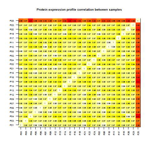
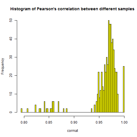
Obviously, each sample has a Pearson's correlation of 1 with itself - hence the 0 down the diagonal. They also, with one bright red exception which I'll address shortly, correlate highly with one another - around .97 between any two samples, as you can see in this histogram of the individual correlations:
# histogram of correlations between samples
png('allxall.correlation.histogram.png')
hist(cormat,breaks=100,main="Histogram of Pearson's correlation between different samples",col='yellow')
dev.off()
This high correlation between samples is to be expected. Though gene expression varies between individuals and between experimental conditions - that's the point of doing gene expression analysis - there are still certain basic truths in this world: all our cells need beta actin (ACTB) and ribosomal proteins like RPS11 - these should be universally high, while others will be universally low. You can check which genes are most highly expressed:
# check which genes are most highly expressed
unique(annot$Gene.symbol[rowMeans(ma_mat) > 50000])
Almost all of these top hitters are ribosomal:
> unique(annot$Gene.symbol[rowMeans(ma_mat) > 50000])
 [1] "RPL34"                "RPL19"                "RPS11"                "RPS24"                "RPL30"                "RPS10"                "RPS3A"
 [8] "DCAF6///ND4"          "DCAF6///HNRNPM///ND4" "ACTB"                 "RPL7A"                "RPS16"                "RPL10A"               ""
I've seen microarray datasets with correlation between samples averaging around .97 or .98 or as low as .85 - it appears to depend on which probes are included, though I haven't totally wrapped my mind around it yet - and I also get about .85 in mRNA-seq FPKM datasets as well. I should note here that all the datasets I've worked with have been human samples - I can't comment on the expected correlation in, say, mouse datasets where all the mice are expected to be virtually genetically identical except for sex and any genotype being tested (e.g. knockout versus wild-type).
If levels of each gene are quantified relative to a reference, then you can't compare Gene A to Gene B and so any correlation in the correlation matrix will be very weak, really only reflecting the reference's deviation from the samples' mean, as all samples will appear high for proteins where the reference happened to be abnormally low. If that's the case, you'll get a matrix of deep red, where correlations between samples are low or nonexistent. It's hard to tell such a situation apart from a situation where the data are just incredibly lousy and noisy, and I'm not sure how to QC data where there isn't even an expectation of comparability between genes. I don't fully understand those sorts of datasets, so I won't say too much - but at least creating this sort of correlation matrix can be a first step towards figuring out what's going on.
Besides giving you a sense of the character of the data, this correlation matrix can also identify outliers. In the matrix, it's quite clear that P25 is an outlier which correlates poorly with all other samples - it accounts for the somewhat lower, ~.85 correlations in the histogram as well. It's a judgment call as to when a sample is bad enough that you need to remove it, but if you wanted to, here's one way to do it:
# figure out which one is a problem
problem_sample = rownames(cormat)[rowMeans(cormat) == min(rowMeans(cormat))]
problem_sample
# how to remove the problem sample if you want to
ma_mat_cleaned = ma_mat[, -which(colnames(ma_mat) == problem_sample)]
dim(ma_mat_cleaned)
# and if you do, don't for get to update sex, patient_id etc. all your metadata vectors to match
# but I'll leave it in for now.
But for the purposes of this exercise I'll leave it in. Just note that if you start removing columns from your matrix you have to remove items from your metadata as well so that the vector elements still line up.
In theory, this correlation matrix should also be able to highlight duplicate samples - two samples that correlate exceptionally well with each other. That's good for checking the reproducibility between intentional duplicates, or noticing cases where there exist unintentional duplicates due to sample mixups. In microarray data where the correlation is .98 even between different samples, noticing a duplicate might be harder - not sure because I haven't seen one.
grouping by gene symbol??
Then comes the difficult question of whether you can in some way group your data by gene. As noted above, SOFT files are in theory already normalized and combined across different probes for the same gene, yet you'll find that there is a many-to-one or many-to-many relationship between probes and genes or transcripts:
# explore relationship between probes, genes and transcripts
length(unique(annot$ID)) # probes
length(unique(annot$Gene.symbol)) # gene symbols
length(unique(annot$GenBank.Accession)) # GenBank Accession numbers, ~= RefSeq transcripts
In this case there are 22,645 probes for 17,880 transcripts of 10,274 genes. The safest thing to do is just analyze probe-level data. But what if you need to combine with another data source, and the only key to join on is gene symbol? This demands some way of grouping the microarray data by gene symbol. Are the multiple probes per gene considered to be measuring the same thing (so you could average them) or distinct transcripts (so you could add them)? This answer is often not easy to come by, and I actually could not figure out the answer for this example dataset. If you don't know, the safer thing to do is to only join your other dataset to genes that map one-to-one with a single probe.
For the sake of example, I'm going to assume that grouping by gene symbol and taking the average of probes is okay:
# try grouping by gene, averaging
ma_gene_raw = aggregate(ma_mat ~ annot$Gene.symbol, FUN='mean')
ma_gene = as.matrix(ma_gene_raw[,2:26]) # shave off the extra column added by aggregate
rownames(ma_gene) = ma_gene_raw[,1] # set that extra column as the row names
colnames(ma_gene) = colnames(ma_mat)
dim(ma_gene) # 10274 25 - we have 10,274 genes and 25 samples
look at some housekeeping genes
Now that I have the data grouped by gene, I'll plot a housekeeping gene to see how consistent its expression level is. Let's try GAPDH:
# plot the levels of the housekeeping gene GAPDH
png('barplot.gapdh.absolute.level.png')
barplot(ma_gene["GAPDH",],col='yellow',main='Absolute levels of GAPDH',cex.names=.5,las=2)
dev.off()
range(ma_gene["GAPDH",])
# figure out which one is so high
which(ma_gene["GAPDH",] > 40000)
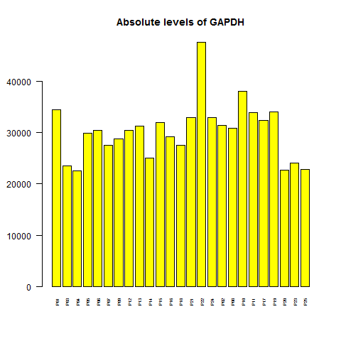
The levels vary by a factor of ~2 from highest to lowest - that's not awesome for a gene that is supposed to be so constant that it's used as a loading control on Western blots, though of course it does have real biological variation [Barber 2005]. Also, it turns out that one really high bar is P22, not P25, the outlier sample from the correlation matrix. How worried should we be about the variation in GAPDH? Well, luckily it turns out that if you consider GAPDH's rank relative to other genes, rather than its absolute level, at least that is more stable:
# transform whole matrix to rank space
ma.rank = ma_gene
for (i in 1:25) {
  ma.rank[,i] = rank(-ma_gene[,i],na.last='keep')
}

png('barplot.gapdh.rank.png')
barplot(dim(ma.rank)[1] - ma.rank['GAPDH',], ylim = c(1,dim(ma.rank)[1]), yaxt='n', col='yellow', cex.names=.6,las=2, main = "GAPDH rank relative to other genes")
axis(side=2, at = c(1,5000,dim(ma.rank)[1]), labels=c("lowest","5000","1 (highest)") )
dev.off()
Note that R's rank function considers the lowest value to be #1 and the highest to be #N, which is unconventional. I added a minus sign inside the call to rank to get the highest value to be #1, and then inverted the y axis so that 1 is at top.
![]()
Sure enough, GAPDH is very close to being the highest ranked gene in every sample. That's because, due to the exponential distribution, there just aren't many other genes whose expression is even in league with GAPDH.
By contrast, a non-housekeeping gene might be more variable in both absolute level and rank. I often use PRNP for this, but weirdly it's not in this dataset, so I used its downstream paralog, PRND (doppel):
# compare to PRND, which is not a housekeeping gene
png('barplot.prnd.absolute.level.png')
barplot(ma_gene["PRND",],col='yellow',main='Absolute levels of PRND',cex.names=.5,las=2)
dev.off()
range(ma_gene["PRND",])
# 20.2 722.4

png('barplot.prnd.rank.png')
barplot(dim(ma.rank)[1] - ma.rank['PRND',], ylim = c(1,dim(ma.rank)[1]), yaxt='n', col='yellow', cex.names=.6,las=2, main = "PRND rank relative to other genes")
axis(side=2, at = c(1,5000,dim(ma.rank)[1]), labels=c("lowest","5000","1 (highest)") )
dev.off()
PRND's expression level varies 36-fold, from 20 to 722.
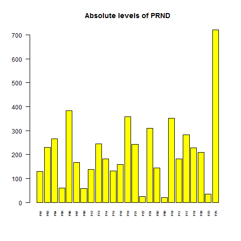
And even in terms of rank, it's quite variable, going from the upper half of the distribution to the very bottom.
![]()
test for sex differences
Another basic truth is that many genes are expressed at different levels in females and males. If you can't see this in your data, that could be a worrisome sign either about the data quality or just that you've messed something up along the way - for instance, incorrect matching of metadata to columns in your expression matrix. If you're planning to test some other variable - say, time series, treated vs. untreated, knockout vs. wild-type, etc. for differential gene expression, your positive control should be that you do see some genes differentially expressed according to sex.
To do this, I'll loop through the matrix and t test each and every probe for male/female differences, and I'll use gap's qqunif to plot the resulting p values.
# test each and every probe for sex differences
sex.p.vals = vector(mode="numeric",length=dim(ma_mat)[1])
for (i in 1:dim(ma_mat)[1]) {
  sex.p.vals[i] = t.test(ma_mat[i,] ~ sex)$p.value
} # this loop takes ~ 1 minute

png('sex.probe.qqplot.png')
qqunif(sex.p.vals,pch=19,main='QQ plot of microarray probes associated with sex',cex.main=.8)
abline(h=-log10(.05/dim(ma_mat)[1]),col='darkgreen')
text(0,-log10(.05/dim(ma_mat)[1])+.25,labels='Bonferroni-corrected .05 significance threshold',col='darkgreen',pos=4,cex=.6)
dev.off()
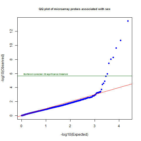
Sure enough, there is quite a departure from the null at the top of the distribution, with several probes crossing the Bonferroni significant line. The lowest corrected p value is 8e-10.
# get lowest Bonferroni-corrected p value
min(sex.p.vals * dim(ma_mat)[1])
# get lowest FDR-corrected p value
fdr.corrected = p.adjust(sex.p.vals, method="hochberg")
min(fdr.corrected)
Supposedly, p.adjust with method="hochberg" does an FDR correction which is more lenient than Bonferroni, but every time I've used it it gives exactly the same value as the Bonferroni correction.
You might also want to check that most or all of the differentially sex-expressed genes are on the X and Y chromosomes:
# which genes are sex-associated? which chromosome are they on?
unique(annot[annot$ID %in% rownames(ma_mat)[sex.p.vals < .05/dim(ma_mat)[1]], c("Chromosome","Gene.symbol")])
Sure enough, in this case it's XIST and TSIX on the X, and TXLNG2P on the Y. In some datasets I've also seen a much longer list of sex-associated genes.
principal components analysis
Next I like to get a handle on what, if anything, the principal components of the data appear to capture. For instance, if the data are combined from two different microarray technologies or two different mRNA-seq library preps, you might get a strong batch effect which clearly separates the samples as PC1. Or sometimes I see PC2 or PC3 separating the samples by sex. Whatever it is, you're better off knowing.
I calculate principal components "manually" as introduced in this tutorial. My laptop crashes if I give it the full 22645x25 matrix. The right thing to do is run this on a high-powered computing cluster, but for the sake of this demo, I'll just select a random subset of the probes and run PCA on that. Note that PCA can't handle NA values, so if your dataset has any, you'll need to convert them to 0, or the row mean, or some numeric value for the purposes of PCA - hopefully a numeric value that reflects the true meaning of NA in the case of your dataset - see this StackExchange discussion. The fewer NA values you have, the less it matters what you convert them to.
# select random subset of 10% of the probes to run PCA
set.seed(2222)
random.subset = ma_mat[runif(n=dim(ma_mat)[1],min=0,max=1) > .9,]
# now calculate principal components
tmat = t(random.subset) # transpose
sum(is.na(tmat)) # 0
tmat[is.na(tmat)] = 0 # convert NA to 0 for PCA
covmatrix = cov(tmat) # calculate covariance matrix
eig = eigen(covmatrix) # this takes about 1 minute
pc = tmat %*% eig$vectors # multiply matrices to get principal components# eig = eigen(covmatrix)
Now let's plot just the first two PCs against each other and see what we see:
# plot PC1 vs. PC2
png('pc1.vs.pc2.png')
plot(pc[1:25,1],pc[1:25,2],pch=19,main='PC1 vs. PC2',cex.main=.8,xlab='PC1',ylab='PC2')
points(pc[sex=='M',1],pc[sex=='M',2],pch=19,col='blue')
points(pc[sex=='F',1],pc[sex=='F',2],pch=19,col='red')
text(pc[1:25,1],pc[1:25,2],labels=colnames(ma_mat),pos=1)
dev.off()
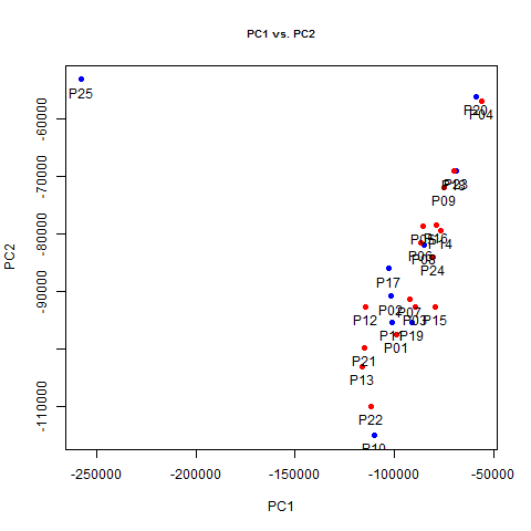
Whoa! PC1 exists almost solely to distinguish P25 - that one weird outlier sample that showed up in red on the correlation matrix - from everyone else. This is another good sign that something must have gone wrong with that sample and we might want to throw it out. In fact, not only does PC1 pretty much just separate that guy from everyone else, it does so with a vengeance, explaining 70% of overall variance in the dataset, which we can see by plotting variance explained.
# plot the variance explained by each PC
png('pc.variance.explained.png')
plot(1:50,(eig$values/sum(eig$values))[1:50],pch=19, xlab='PC#', ylab='Varaince explained', main='Variance explained by PCs')
dev.off()
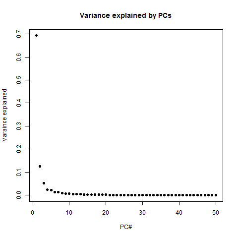
PC1 explains 69% of variance, PC2 explains 12%, and after that it really trails off dramatically - you can explain almost the whole dataset with just 3 or 4 PCs. Another way to see this is in the cumulative variance explained:
# alternate way is to look at cumulative variance explained
png('pc.cumulative.variance.explained.png')
plot(1:50,cumsum(eig$values/sum(eig$values))[1:50], pch=16, type='b', ylim=c(0,1), xlab='PC#', ylab='Cumulative varaince explained', main='Cumulative variance explained by PCs') # running total of variance explained
dev.off()
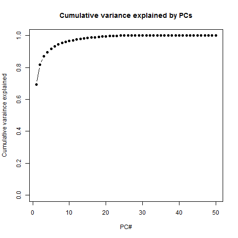
In other words, you get close to 100% pretty fast. Is that good or bad? It reflects the low information entropy of this dataset: P25 is really different from all the other samples, but once you explain that away, the rest of them are really very similar to each other - hence the inter-sample correlation of ~.97 we saw earlier. In that sense there's not a ton of information here. But this just reflects the fact that the dataset accurately captures the genuinely huge stratification in expression levels between different genes, as seen in the exponential distribution plotted earlier.
The alternative is a high information entropy dataset which can't easily be compressed into a few principal components. This may be what you'll see if you have, say, proteomics data quantified relative to a reference sample. But I don't know how to QC such a dataset (unless you have external validation - protein levels quantified by a different method as a ground truth) because it ends up looking a lot like random noise. To show what random noise looks like, I'll invent a data matrix of just normally distributed random numbers, and plot the variance explained by PCs.
nrow = dim(random.subset)[1]
ncol = dim(random.subset)[2]
random.numbers = matrix(rnorm(n=nrow*ncol,m=0,sd=1),nrow=nrow,ncol=ncol)
random.numbers[1:5,1:5]

rtmat = t(random.numbers) # transpose
rcovmatrix = cov(rtmat) # calculate covariance matrix
reig = eigen(rcovmatrix) # this takes about 1 minute
rpc = rtmat %*% reig$vectors # multiply matrices to get principal components# eig = eigen(covmatrix)
png('pc.variance.explained.in.random.numbers.png')
plot(1:50,(reig$values/sum(reig$values))[1:50],pch=19, ylim=c(0,.50), xlab='PC#', ylab='Varaince explained', main='Variance explained by PCs')
dev.off()

I put the y axis at the same scale as the real data above, just to emphasize the difference here: PC1 only explains ~5% of variance, and it takes all 24 PCs to explain 100%. This, by the way, is the reason why I've plotted the x axis from 1 to 50 in each of these plots even though we only have 25 samples and so by definition the variance can be explained in 24 PCs. I find it useful to see that sharp dropoff from 24 to 25 reminding us that even the last PC is explaining a good bit of the variance. All this is to say, datasets full of random noise don't compress easily, and so while having lots of information content in your data may sound like a good thing, it's awfully hard to tell that apart from a dataset with no useful information at all.
One final thing to do with PCs is check if any of them correlate with sex or with a variable of interest. You can see from the PC1 vs. PC2 plot above that neither of those PCs is correlated with sex, but we can also t test the first few just to see:
# do any PCs correlate with sex?
t.test(pc[1:25,1] ~ sex)
t.test(pc[1:25,2] ~ sex)
t.test(pc[1:25,3] ~ sex)
t.test(pc[1:25,4] ~ sex)
t.test(pc[1:25,5] ~ sex)
In this case, the answer is no. I think it's debatable how many you should bother testing. If you tested all 24 PCs and one of them was correlated with sex at p = .04, that wouldn't really be very surprising. If a variable isn't correlated with the first few PCs or else with a later PC but with a very strong p value, I usually consider any correlation to be just a coincidence.
combine with other datasets
It's ideal if you have some other data on the same samples that you can use to ground truth them and see if the new data at least correlates somewhat with the other data. Failing that, sometimes it is interesting to at least compare your data to some other gene expression data, even if from different cells and on a different technology. For lack of anything else, I decided to compare these microarray data to the Human BodyMap 2.0 mRNA-seq FPKMs that I posted here. (Google Drive doesn't let me link directly to a file so I couldn't figure out a way to wget this - just download manually I guess).
Since the microarray data were prepared from human blood, I combine them with the blood FPKMs from Human BodyMap. Here I use sqldf (see also sqldf's Google Code site) to group across microarray samples to get average levels for each gene, and to join to the Human BodyMap data.
# combine with mRNA-seq data from blood from Human BodyMap 2.0
hbm_df = read.table('gene.matrix.csv',sep=',',header=TRUE,stringsAsFactors=FALSE) # load table
hbm_matrix = as.matrix(hbm_df[,2:17]) # cast the FPKM columns to a matrix
rownames(hbm_matrix) = hbm_df[,1] # assign gene symbols as row names
hbm_rel = melt(hbm_matrix) # cast the HumanBodyMap 2.0 matrix into a 3-column relational model
colnames(hbm_rel) = c('gene_id','tissue','fpkm') # set column names

ma_gene_rel = melt(ma_gene) # cast the microarray matrix into a 3-column relational model
colnames(ma_gene_rel) = c('gene_id','sample','level') # set column names

sql_query = "
select   ma.gene_id, ma.level, mrna.fpkm
from     (select gene_id, avg(level) level from ma_gene_rel group by gene_id) ma,
         hbm_rel mrna
where    ma.gene_id = mrna.gene_id
and      mrna.tissue == 'blood'
;
"
ma_mrna_compare = sqldf(sql_query)

png('microarray.vs.humanbodymap.png')
plot(ma_mrna_compare$fpkm, ma_mrna_compare$level, pch=19,
     xlab='Human BodyMap 2.0 Blood FPKMs',
     ylab='Average level in microarray across 25 samples',
     main='Aggregate gene expression level, microarray vs. Human BodyMap 2.0 blood mRNA-seq',
     cex.main = .8)
dev.off()

Comfortingly, despite some weird outliers, there is a visible correlation between each gene's average expression level in the microarray data and its level in the Human BodyMap 2.0 mRNA-seq data. It's not super clean or linear - surely some combination of microarray vs. RNA-seq differences plus the fact that these are different individuals, different RNA prep protocols, and so on. But at least, again, some of these "basic truths" - some genes are highly expressed and others not - appear to be preserved. In fact, overall there is a reasonably strong correlation between a gene's average level in the microarray data and its FPKMs in the mRNA-seq data:
cor.test(ma_mrna_compare$fpkm, ma_mrna_compare$level, method='pearson') # .58
cor.test(ma_mrna_compare$fpkm, ma_mrna_compare$level, method='spearman') # .65
And not suprisingly, the rank of the genes, measured by Spearman's correlation, is better preserved (rho = .65) than the absolute level of the genes, measured by Pearson's correlation (rho = .58).
full script
Here is the full R script for this example: gene-expression-qc.r
discussion
I built this example around this example microarray dataset just to have an example that readers could follow along with if desired. I run these analyses, with minor variations, on pretty much every dataset that I get. There are obviously more specific things you can do depending on the type of data (in fact, I don't know microarray especially well and may have committed some grave misunderstandings in this analysis - if so, please let me know).
But these are at least some sanity checks to see if the data look reasonable. If I see uninformative principal components, no sex-associated genes, weird or inconsistent expression patterns that are too variable for housekeeping genes or don't mesh with what I know from other datasets, then I start to worry that something has gone gravely wrong upstream and needs to be addressed before any research questions can be answered with the data.
Leave a comment to let me know if it's useful, and tell me what else you do with your data to check if it's reasonable.

About Eric Vallabh Minikel
Eric Vallabh Minikel is on a lifelong quest to prevent prion disease. He is a scientist based at the Broad Institute of MIT and Harvard.