Visualizing staining variation using matplotlib
Problem statement: I’ve got a stack of H&E-stained mouse brain section images I want to run through the same image segmentation pipeline, but the images are all a bit differently colored. Observe:
The biologists tell me that a lot of the reason for this lies in how the slides are stained. I guess hematoxylin literally but not figuratively grows on trees, so common practice is to create a single stain bath and then dip the slides into it one after another, which means the later slides might pick up less stain than the first ones. Some of the problem may also have to do with different exposure on the camera. In any event, it’s a common problem with H&E staining that slides don’t all turn out looking quite the same. So if you’re working on a segmentation pipeline like I am, that depends on rescaling the contrast of an image using particular thresholds you calculate or observe, then these variations in color are a big problem.
It’s clear that before these images go into a pipeline I need to do something to make them look more alike. A friend suggested Photoshop’s Match Color command, which seems like the right idea, but I don’t own a Photoshop license, and I also don’t feel totally comfortable with the fact that Adobe doesn’t actually explain exactly what the command does (the math is all hiding behind the noun phrase “advanced algorithms”). Plus, I figure this new challenge can be an opportunity to teach myself something with broader usefulness rather than just learning how to use a piece of Adobe’s software.
So before figuring out what transformations I might apply to these images, I set out to visualize the problem. You know what turns out to be awesome? matplotlib. It’s Python’s package for doing graphs and charts and all manner of data visualizations, and it’s an amazing tool which promises to finally free me from the clutches of Microsoft Excel. So I set out to learn matplotlib in order to be able to graph the color spaces of these different images and visualize exactly how they differ.
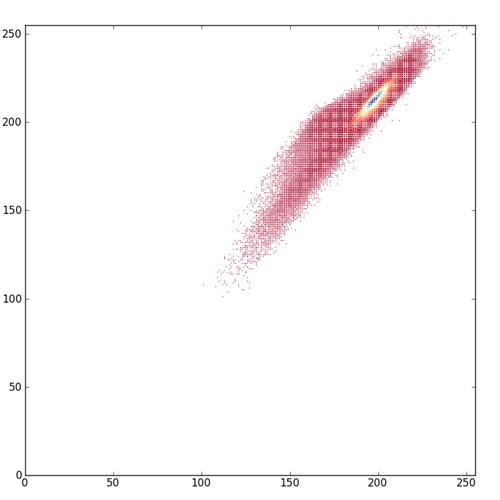
I started with this scatterplot example from the matplotlib gallery, then learned how to control marker size and color, then how to use color as a third dimension in a 2D scatterplot. Pretty soon I was able to create images like this:
What you’re looking at here is a scatterplot of all pixels in one of these H&E images (the 4th one in the top row above), with the red value (0 – 255) on the x axis and the blue value (0 -255) on the y axis, and color proportional to how many pixels in the image are of a given color. Notice how little of the potential color space is actually used by the image. It’s pretty low contrast. The points shown in red on the scatterplot are red-blue values with very few pixels of that color, yellow is intermediate, and blue are the values with a lot of pixels. Notice that even within the limited color space this image occupies, a huge fraction of the pixels are right around (200,200). I think of this as a histogram where the coloring of the points is the histo, but you could also just call it a colored scatterplot. You could do this with red v. green or blue v. green too, or a true 3D scatterplot with color as the fourth dimension though I haven’t tried that yet.
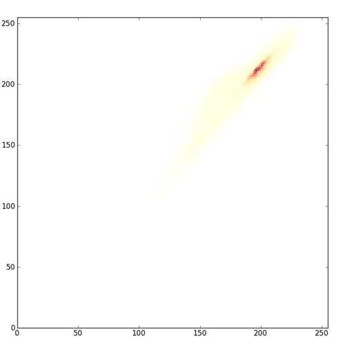
Arguably, the red-yellow-blue color map here is even a bit misleading. It shows you the full extent of color space occupied by the image, but because the red color for the very low values is dark, it makes those points on the scatterplot look important, when actually there are very few pixels of that color. matplotlib offers plenty of other color maps which illuminate the data in different ways; compare the above image to one with this one where the low end of the color map is just white.
This latter plot makes it more clear just how concentrated the pixels are around that (200,200) area and just how lacking in contrast this image really is.
Here’s a script that walks a directory and creates histograms just like this for every TIFF in the directory:
import numpy as np
import matplotlib
import matplotlib.pyplot as plt
from common import *
from matplotlib.ticker import NullFormatter
import os

def histo(root,name):
    filepath = os.path.join(root,name)
    img = getImageAsArray(filepath)
    x = img[:,:,RED].flatten()
    y = img[:,:,BLUE].flatten()
    n = np.zeros((256,256),dtype=float64)  # number of all pixels of given color
    for r in xrange(img.shape[0]):
        for c in xrange(img.shape[1]):
            n[img[r][RED]][img[r][BLUE]] += 1.0
    nullfmt   = NullFormatter()         # no labels

    # definitions for the axes
    left, bottom, width, height = 0.05, 0.05, 0.9, 0.9
    rect_scatter = [left, bottom, width, height]

    # start with a rectangular Figure
    fig = plt.figure(1, figsize=(8,8))
    axScatter = plt.axes(rect_scatter)
    # define color array and color map
    c1 = np.zeros(x.shape[0])
    for idx in xrange(c1.shape[0]):
        c1[idx] = n[x[idx]][y[idx]]
    cmap1 = matplotlib.cm.get_cmap('YlOrRd')

    axScatter.scatter(x, y, s=1, lw=0, vmin=0, vmax=c1.max(), c=c1, cmap=cmap1)

    axScatter.set_xlim( (0, 255) )
    axScatter.set_ylim( (0, 255) )

    plt.savefig(os.path.join(root,"histo_"+name))

if __name__ == "__main__":
    imgDir = "c:/cureffi/is/imgs/use/"
    for root, dirs, files in os.walk(imgDir):
        for name in files:
            if (name)[-4:] == '.tif':
                print("Processing file: "+os.path.join(root,name))
                histo(root,name)
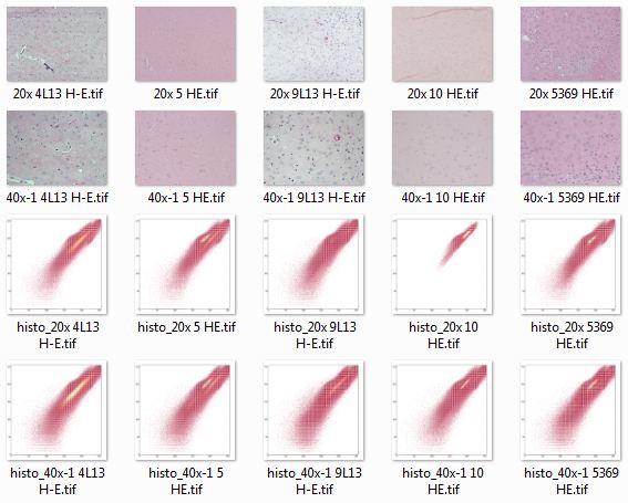
Looking at all of these histo images together, it’s easy to see some of how the color space is different between images:
The above screenshot gives you an overview, but the most illuminating thing is to put these all in a folder, gallery or slideshow and click through them with your forward arrow to see what changes between images.
- Difference in contrast. 20x 10 HE.tif, the first example above, has a lot less contrast than the others. (Plotting with the yellow-orange-red colorspace, though, shows that none of them have as much contrast as the red histos above would make you think).
- Bimodality. In 20x 10 HE.tif, there is really only one central tendency, right around (200,200). In some of the others, particularly 40x-1 5 HE.tif, you can actually see two separate streaks of yellow in the plot.
- Difference in mean. The darkest yellow or blue streak in each histogram presumably corresponds to the primarily eosin-stained ‘background’ between nuclei in each image. As you click through you can see it move up and down the y=x diagonal axis (i.e. lighter or darker background) and also hop to the left or right of that diagonal (i.e. bluer or redder background).
To be really thorough, I should also do the same sort of plots as above, with the green channel in the mix too and see if I notice anything else. Another next step may be to do this with human-drawn ground truths and see how the distribution of the nuclear pixels’ colors varies between images. It’s a bit trickier to show two datasets (nuclear and non-nuclear pixels) together– you either need to put them on the same plot which I haven’t gotten to work yet, or overlay them with transparency. But since matplotlib’s color maps are for just the RGB channels and not the alpha channel, you actually have to create your own alpha transparency map.
But at least, for today, I’ve got a bit more concrete idea of how the colors are different and what would be needed to correct for this. Plus, I’ve made a first foray into what looks to be a pretty sweet tool for visualization.


