Charting the PrP archipelago with TROSY

Image credits: TROSY NMR spectrum of recombinant human PrP23-230 produced by myself, Sonia Vallabh, and Mike Mesleh — data and code are available in this GitHub repository and experimental details appear further below in this blog post. CC BY-SA Fairy Prion bird by Sabine’s sunbird via Wikimedia Commons. CC0 north arrow by Pixabay. Public domain font Berry Rotunda from Dafont.
What is TROSY?
Transverse relaxation optimized spectroscopy (TROSY) is a 2-dimensional biomolecular NMR technique that has been widely used since Kurt Wuthrich’s group introduced it about 20 years ago. I’ve now had the chance to perform TROSY a few times on recombinant prion protein (PrP), and I’ll share my experience in detail in this post, though that doesn’t mean I know quite how it works. I’ve looked at the original paper introducing TROSY [Pervushin 1997], but I don’t think I qualify as having “read” it since I don’t sufficiently grasp the physical fundamentals of NMR in the first place to be able to understand the paper. But at least, from reading some things like this blog post, and from having it explained to me a few times, I understand a few basics about TROSY and when/why it is useful.
Structures of very small proteins can be solved through proton NMR, but for larger proteins, you need to acquire a second or third dimension of chemical shifts, usually by 15N- and/or 13C-labeling your protein. One 2-dimensional technique is 15N-1H heteronuclear quantum coherence spectroscopy (HSQC), which allows you to visualize a 2-D landscape of chemical shifts, with each peak corresponding to one amide. This means you get a peak for each NH in the peptide backbone of your protein (and thus one per amino acid except for proline) as well as for the side chains of asparagine, glutamine, and tryptophan. In larger proteins, these peaks to become too broad to distinguish. TROSY, which is sort of a special case of HSQC, provides much crisper peaks and suppresses the asparagine and glutamine side chains.
Neither HSQC nor TROSY on its own tells you which peak is which residue in your protein. The assignment of peaks to residues is usually done through 3D NMR with both 15N and 13C labels. But once someone has done the 3D experiment once and published an assignment of the peaks, you can often use their assignments as a handy reference to tell which peak in your TROSY spectrum corresponds to which amino acid. But, as we’ll see in this post, that part is not trivial.
Why do all this? One application of TROSY is to identify or validate ligands of your protein. Small molecules that bind loosely (with fast on/off rates) will tend to make peaks shift around in your TROSY spectrum, and small molecules that bind tightly (with slow on/off rates) can even make peaks disappear entirely. TROSY can thus provide direct physical evidence of ligand binding, and is free of many of the sources of false positives from other types of binding experiments — though like anything, it also has error modes of its own.
Running TROSY NMR
Sonia and I, under the mentorship of Dr. Mike Mesleh, the Broad’s NMR expert, set out to perform TROSY on full-length recombinant human prion protein (HuPrP23-230). We had already managed to purify our protein once (and then a few more times with better yields), and it had good proton NMR and CD spectra — all good things to ascertain before shelling out for the more expensive experiment of 15N labeling.
We bought this $700 bottle of 15N-labeled rich bacterial media from Cambridge Isotope Laboratories, and then asked several people and read the instructions over and over trying to make sure we understood it right before we used it. In case you found this post by Googling the same questions we had wondered, here’s what we found. We simply diluted the 100mL contents of that bottle 1:10 into purified water — with nothing else — for a final volume of 1L, then induced with the EMD Millipore Overnight Express kit, and we got great results. I share this fact because some folks we talked to around the lab told us that their typical process for 15N labeling is to prepare a minimal bacterial media from ordinary raw ingredients, minus any ingredients that contain nitrogen, then dilute an isotope-bearing supplement 1:100 (instead of 1:10) into it. This proposal made us nervous because it seemed to involve many more potential places for us to mess up, plus after careful evaluation, we weren’t certain whether such an approach was compatible with the autoinduction kit, and in any case it didn’t appear to be the recommended use of this product.
With our approach of using only the 15N rich media and the overnight express kit, we were able to purify ~45 mg of 15N-labeled HuPrP23-230 from 1L of broth. (For methods, see the Rocky Mountain Recombinant protocol). For comparison, our last prep of unlabeled HuPrP23-230 yielded ~69 mg (a big improvement over our first PrP prep at Broad, which yielded only 8 mg). So our yield of 45 mg for 15N-labeled protein was fantastic — people had mentally prepared us that our yield might be just a fraction of what we normally get.
We dialyzed subsets of the protein into two different buffers. One batch went into 10 mM phosphate buffer at pH 5.8, which is the “classic” dialysis buffer for our protein. The other batch went into 20 mM HEPES at pH 6.8 — the higher pH is more physiological, and we are told that HEPES does better than phosphate at maintaining a high true positive rate for weak ligands. Our protein preps had begun their life down in the concentration range of 11-13 μM, but TROSY works best at 50-100 μM, so we next used Corning Spin-X UF Concentrators to concentrate the protein. That part is simple: spin some water through the concentrators to rinse, then load protein and spin until it’s down to the desired volume. Spec the protein on the NanoDrop again when you’re done as you might lose a little bit (say 5%) of your protein in the process.
The actual NMR part of the process was incredibly trivial. We mixed 180 μL of our concentrated protein with 20 μL of D2O (the NMR uses the 90/10 H2O/D2O mix to calibrate or “shim” itself), pipetted it into an NMR tube, loaded it into the NMR-coordinating robot that lives atop the Broad’s Bruker 600, selected TROSY from a drop-down menu of experiments, and also picked a temperature (298°K, or 25°C). The TROSY experiment lasts 2 hours and 38 minutes, and once that was done, we had our data. The plots I’ll present in this post are of our first TROSY spectrum, which was with 10 mM phosphate buffer at pH 5.8 and a PrP concentration estimated at ~42 μM based on NanoDrop readings. Our later spectra, in 20 mM HEPES at pH 6.8, looked almost identical, and you can find the raw data for all of these spectra, along with all of the code used for the analyses in this post, in this GitHub repo.
Working with plain text data
The Bruker software includes with various tools to visualize your data, overlay it with other things, call peaks, and so on and so on. But for me, anytime I use a new piece of scientific equipment in the lab, my first question is, how can I export my data in a plain text file that I can load into R or any other program I might care to use?
In this case, it took a solid hour of Googling before I found a solution. Maybe it’s just that not a lot of people want their NMR data in plain text form. The widely used NMR software Sparky, for instance, contains various utilities for converting between several binary formats including Bruker, but does not appear to have any ability to export raw text. The Bruker TopSpin software itself has a convbin2asc command for exporting plain text dumps of 1D NMR spectra, not it doesn’t work for 2D spectra. In any event, when I finally found this solution, the answer was in hindsight the most obvious place to look: just double click a 2D spectrum to open it, then right click anywhere on the visualization, and select “Save Display Region To…” > “A text file for use in other programs”. This worked for me, though I still have one gripe: there does not appear to be any way to specify the resolution at which to export. You only get 1024 × 512 pixels for the whole spectrum, period. If you zoom in on the spectrum before you do the right clicking, you simply get fewer pixels.
Once the text file is exported, it is still not trivial to work witht. The 13 header lines at the top specify, among other things, the limits of the axes and the number of points along each — so deriving the x and y coordinate of each cell is left as an exercise. The actual z data are then provided at a rate of one pixel per line, with periodic comment lines such as # row = 150 reminding you what row you’re on. Here are the first 15 lines of one of our files as an example:
# File created = Thursday, March 31, 2016 1:10:20 PM EDT
# Data set = huPrP-Batch8-HEPES-Control  1  1  C:\Bruker\TopSpin3.5pl2\mmesleh
# Spectral Region:
# F1LEFT = 135.00100708007812 ppm. F1RIGHT = 99.999003401019 ppm.
# F2LEFT = 11.462869644165039 ppm. F2RIGHT = 4.700490974763106 ppm.
#
# NROWS = 512 ( = number of points along the F1 axis)
# NCOLS = 1024 ( = number of points along the F2 axis)
#
# In the following ordering is from the 'left' to the 'right' limits!
# Lines beginning with '#' must be considered as comment lines.
#
# row = 0
-227.7861328125
-431.818359375
To cope with this, I wrote this Python script, which converts these data to a tab-delimited matrix of 512 rows (15N shifts) and 1024 columns (1H shifts), with row and column names indicating the x and y coordinates. This matrix can then be read into R using one line of code, such as:
spec = as.matrix(read.table(path,row.names=1,header=TRUE,quote='',comment.char='',skip=8,sep='\t'))
In TROSY, negative peaks are not informative, and from looking at my spectra I also felt that positive peak heights didn’t seem important beyond a certain threshold, so I also truncated my z values to a range from 0 to 20,000. And R’s image function for plotting xyz data assumes x is rows and y is columns, so I also transposed the matrix:
spec = pmax(spec, 0.0)
spec = pmin(spec, 20000)
spec = t(spec)
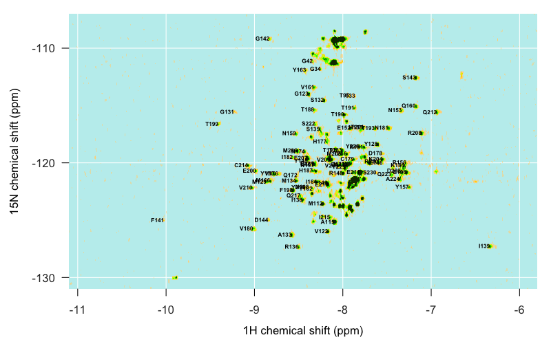
With that, I was ready to start plotting. I won’t bore you with all the details — just see the whole R script if you want those. Here’s the plot I generated:
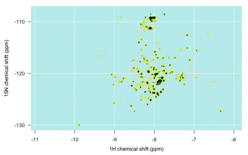
Here’s a brief rundown of what we’re looking at, though much of this will become clearer later in this post. As indicated (albeit in more fanciful language) at the top of this post, the islands can be identified roughly as follows. The structured, globular C-terminal domain of PrPC is spread across the middle of the map, mostly in the form of distinct single peaks, though a few overlap. Apparently alpha helical residues often tend to be nearer to -8 on the 1H axis, while beta sheet residues tend to be nearer to -9, though that isn’t particularly true for PrPC, as we’ll see in a moment. The islands to the far west and far east are residues occupying more unique local environments, your loops and turns and hairpins and so forth. Residues in unstructured regions of the protein are likely to be found in environments almost indistinguishable from one another, and so are less spread out and more likely to overlap one another. For instance, as I eventually learned in PrPC, the backbone amides of the N-terminal tryptophan (W) residues are piled up on top of each other in one big ridge just southeast of -8, -130, hence its name “W. Backbone Ridge” in the map at top. Glycines are found in the far north, around -110 ppm on the 15N axis. The indole amide of tryptophan’s side chain — the only side chain not filtered out in TROSY — is found in the extreme southwest, around -10 1H, -130 15N.
So that’s the big picture, but for this to be useful, I still needed to know exactly which peak corresponds to which residue. How to do that?
Assigning peaks
If the peaks of your protein have never been assigned before, doing so is a big undertaking, and requires other experiments besides TROSY. But I’m in the lucky position that PrPC’s peaks have been assigned and its structure solved, many times over. So in principle, assigning peaks for me should just involve a couple hours of glancing back and forth between someone else’s assignments and my spectrum and deciding which island on my map corresponds to which peak in their spectrum.
For starters, I needed to find some existing assignments to compare to. Although I’m used to heading over to PDB for protein structures derived from NMR, PDB does not actually store the underlying NMR data used in determining structures. Those data are stored in BMRB. Even BMRB, it turns out, does not actually house any spectral data, but instead only archives the xy coordinates of peak assignments.
Looking around BMRB, I realized that every available set of peak assignments for PrP differed from us by at least one experimental variable. Ralph Zahn had published assignments of full-length human PrP [Zahn 2000], but at pH 4.5, whereas we had PrP had pH 5.8 and 6.8. We could have re-dialyzed into a more acidic buffer to match, of course, but we wanted to be doing experiments at a more physiological pH. Zahn later published assignments at pH 7.0, but only for truncated protein (HuPrP121-231) [Calzolai & Zahn 2003]. In the end, I chose four sets of assignments as references to look at while trying to assign my peaks:
| BMRB entry | experiment | reference |
|---|---|---|
| 4379 (data) | HuPrP121-231 at pH 4.5 | Zahn 2000 |
| 4402 (data) | HuPrP23-231 at pH 4.5 | Zahn 2000 |
| 4641 (data) | HuPrP90-231 E200K at pH 4.5 | Zhang 2000 |
| 5713 (data) | HuPrP121-231 at pH 7.0 | Calzolai & Zahn 2003 |
Note that some, but not all, BMRB entries have a “Data Visualization” link that will pull up a plot of the assignments, yet all of them seem to have a link to a plain text file containing the underlying assignment data in NMRSTAR v3.1 format — those are the “data” links I’ve added in the table above.
I had been told that amino acids in unstructured domains have relatively similar chemical environments, and so are relatively undifferentiated in position on 2D NMR and tend to pile up as one big mountain. In Zahn’s spectrum of full-length PrP (4402), that’s true to a degree:
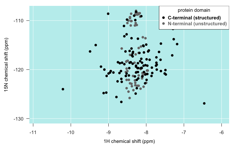
As you can see, most of the residues in the unstructured N terminal domain do actually appear as individual peaks. But certainly, they are spread out over a narrower range of latitudes than residues in the C terminal domain, and some really do pile right on top of one another. As mentioned earlier, the “big island” of our archipelago appears to be comprised largely of the backbone amides of the five tryptophan (W) residues in PrP’s N terminus.
I had also been told that alpha helical residues tend to be closer to the -8 longitude, and that beta sheet residues are closer to -9. PrPC only has two very short beta strands, so there’s not a lot of data here, but for what it’s worth, those few residues seem to be all over the map. Here is just the globular domain of PrP from Zahn’s truncated PrP structure (4379), colored by secondary structure membership:
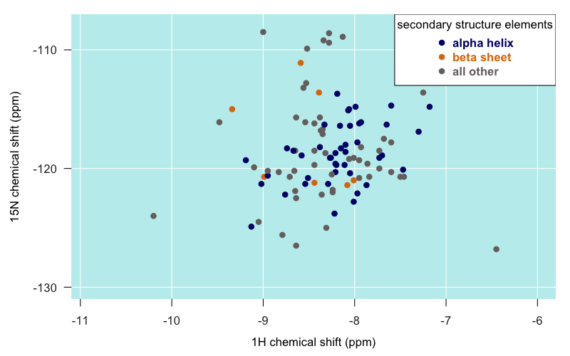
Certainly, the furthest-flung islands do indeed tend to be those in loops and turns rather than in alpha helices or beta sheets.
Comparing several sets of assignments proved to be very informative. In general, among all the pH 4.5 experiments, the differences in peak positions between the different PrP constructs were pretty minor, which was actually the major conclusion of those papers — that full-length and truncated PrP have the same structure of the globular domain [Zahn 2000] and that E200K PrPC has the same structure as wild-type PrPC [Zhang 2000]. This is illustrated in the following plot, where each arrow represents one residue. The origin of the arrow is the position of the residue’s peak in the truncated PrP structure (4379), and the destination of the arrow is the position of the residue’s peak in the full-length PrP structure (4402):
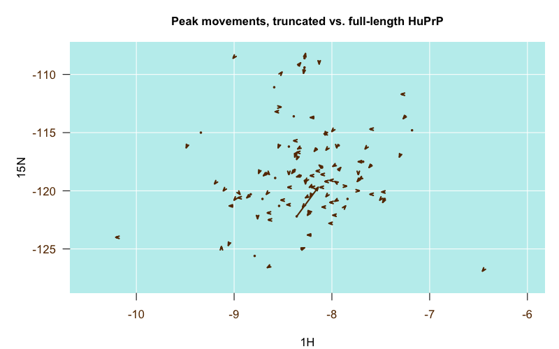
Almost all of the arrows are very short and stubby, indicating the peaks barely budged between the two structures. That one very long arrow in the middle turns out to be residue V121, which was the N-terminal residue in the truncated construct but was smack in the middle of the full-length construct, so that makes sense.
In contrast, when I finally found the pH 7.0 assignments (it was the last one of these that I dug up), I was amazed at how much it differed from the pH 4.5 assignments, and how much more closely it overlaid with our own peaks than the pH 4.5 structures did. I guess pH matters a lot. Here is another of those migration plots, where the origin is the pH 4.5 position and the destination is the pH 7.0 position:
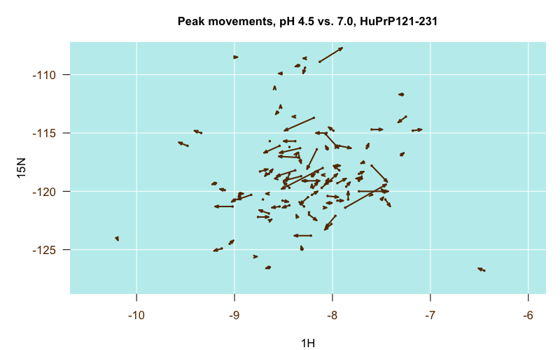
Some residues were particularly stark. For instance, this time, the one longest arrow in the center is residue H187, which leapt from about (-8, -118) at pH 4.5 to (-8.5, -120) at pH 7.0. I guess makes sense, as histidine’s pKa is in between those values, though other histidines didn’t move nearly as much.
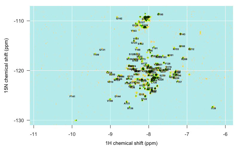
Just from glancing at the above plots, a few assignments are already really obvious — for instance, our sandbar around (-10, -125) is clearly F141. But the closer you get to the center of our archipelago, the harder it is to decipher what’s what. As mentioned above, the pH 7.0 assignments (5713) lined up the most closely with our peaks. Even then, I found that the reported assignments were systematically about 1° north and 0.2 ° west of our islands. After going back and poring over [Pervushin 1997] again I think this is just a systematic difference between traditional HSQC (the technology used to collect the spectra for the published assignments) and TROSY (the technology we used), though I still don’t totally grasp the physical basis of the difference. In any event, once I subtracted 1 from the 15N value and added 0.2 to the 1H value of each reported peak, I was able to overlay the Calzolai & Zahn pH 7.0 spectrum with my peaks and get a reasonably good correspondence:
Even still, they didn’t match up exactly, so I still needed some way to actually record the centroid of each of my peaks and determine which residue each one corresponds to. I spent a bit of time Googling around for any R-based tool that would let me click on a plot and then add the (x,y) value I clicked on to a table, but I didn’t find a trivial solution, so instead I turned to Sparky, a classic NMR analysis and visualization tool. It’s no longer maintained, but Mike Mesleh says it’s still the best tool out there.
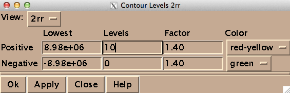
On my Mac OS X machine, Sparky runs through XQuartz, a third-party graphics device. Here’s how to get started. To open a spectrum, go to File > Open, and select a file named 2rr within the deepest directory of your Bruker data folder - in my case the path was /1/pdata/1/2rr. The “2” means it’s a 2-dimensional spectrum, and the rr means you’re getting the real (as opposed to imaginary) component of each axis. The first thing you’ll want to do is type ct to set the contour levels. Choose 0 negative levels (negative peaks are not meaningful in TROSY) and 10 positive levels, and set the color spectrum to red-yellow:
You may want to also manually tweak the “Lowest” setting for positive contours in order to make the noise invisible. Once you’ve got a decent view of your peaks, you can ask Sparky to pick peaks for you programmatically, but I just did it manually while assigning them. For each peak, I navigated to the “Pointer Mode” window, chose “find/add peak”, double clicked on the peak, went back and chose “add label” and then double clicked on the peak again and entered the residue’s one-letter acronym and number. Periodically I would use zi and zo to zoom in and zoom out. Here’s what my process looked like:
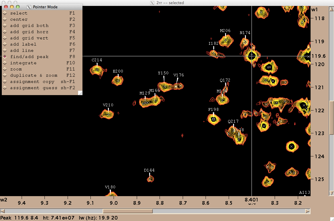
On my machine, at least Sparky had several notable deficiencies. For instance, I couldn’t save my work. When I tried, whether via File > Save or File > Project > Save, it would just say “Saving [filename.save]>” forever, but never saved. Another frustration was that when I would accidentally enter a wrong label for a peak, there was no way to undo this — although this manual claims that selecting and hitting Delete will delete a peak, that actually does nothing in my hands. So after spending a few hours assigning peaks in Sparky, I had tens of assignments I felt good about, a few that I knew were mistakes, and no way to save. I eventually realized my only way to save my work was to export my peak list (Peak > Peak List… Save…), which thankfully did work, and then manually edit the resulting text file to remove the known mistakes.
All in all I spent a few hours command-tabbing between several windows: the overlay of the Calzolai & Zahn assignments with my peaks, the assignments from the other three published spectra, and Sparky. By triangulating between the various specta and making some educated guesses, I was able to assign about half of the distinct peaks in my spectrum, but not all, and even of the ones I did assign, I would 5% or even 10% might be wrong. Here’s what I’ve got:
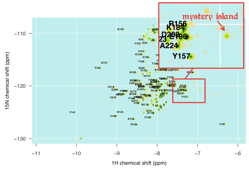
There are also islands in my spectrum that I just can’t account for at all. For instance, this outlying island at about (-6.9, -121) simply does not appear in any of the other spectra I looked at, and I can’t for the life of me make out what it might be:
So at this point, I have 94 assignments in which I am reasonably, but not perfectly, confident. And even where they are correct, some of them overlap each other enough that it may be difficult to discern a difference if just one peak disappears or moves slightly. I welcome any suggestions on what I could do, either experimentally or in the analysis, to try to gain more confidence in these assignments.

About Eric Vallabh Minikel
Eric Vallabh Minikel is on a lifelong quest to prevent prion disease. He is a scientist based at the Broad Institute of MIT and Harvard.