Timepoint-delay plots for comparing prion therapeutics tested in vivo
introduction
I’ve spent several months now reviewing drugs that have been tested in vivo for efficacy against prion disease. I don’t yet have an exhaustive list of experiments that have been done, but want to share some preliminary data and a new method for comparing results.
I’ve come to believe that it’s really important to have some objective way of comparing the relative success of different treatments. Different studies have different incubation times for at least three different reasons: different prion strains, different PrPC expression levels, and different prion titers at inoculation. So saying “Drug A delayed disease by 80 days and Drug B delayed disease by 50 days” is almost meaningless. And then the efficacy of a drug treatment depends on when treatment is started – unfortunately, later = less effective. Starting a drug after at least some symptoms emerge adds a bit of credibility to the notion that your model is a realistic reflection of a timepoint when human patients could be treated. But your ability to find symptoms in the mice at the time treatment is started depends in part on how hard you look, so saying “the mice already had ___ symptom” is also not entirely meaningful.
To try to objectively compare these in vivo studies side by side, I’ve developed a concept I’m calling a timepoint-delay plot, which is crude but hopefully better than nothing. I first employed this concept in this post to compare anle138b with pentosan polysulfate and am working on revising and expanding the idea and using it to exhaustively compare approaches that have been tested in vivo.
the axes
timepoint is the relative time during disease course when a treatment is started. Suppose that animals are inoculated intracerebrally (i.c.) with prions and survival is measured in days post infection (dpi). Timepoint is calculated as:
timepoint = treatment started dpi / control survival dpi
For now I’m referring to it in decimals, so for instance “time .50″ (read: “time point five oh”) is halfway through the disease course. For uninoculated models of familial prion diseases, I am considering day of birth to be time 0.
delay is the relative extension of survival:
delay = treatment group survival dpi / control survival dpi
application to i.c. survival studies
Here is a timepoint-delay plot of all the experiments from studies I’ve reviewed on this blog where the animals were infected i.c. and the endpoint measured in the experiment was survival:
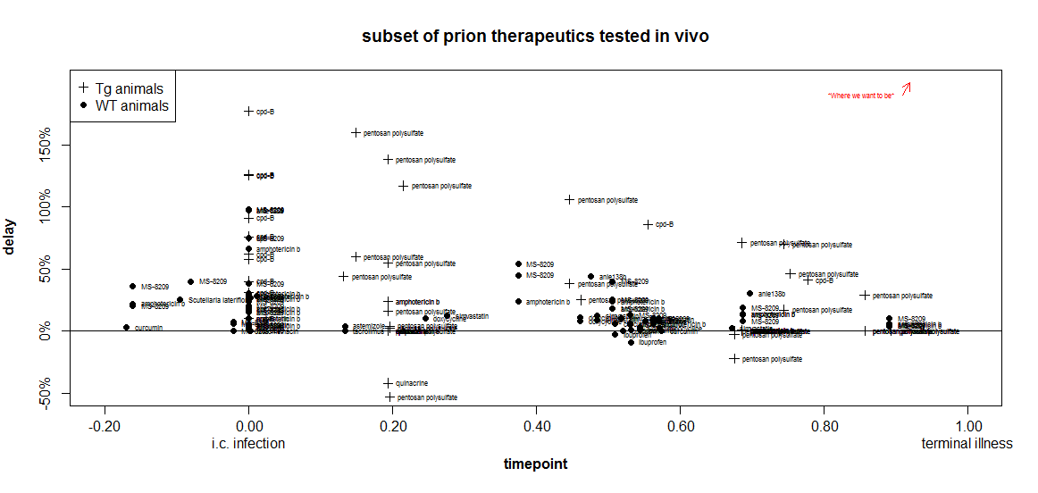
Remember that the closer something is to the upper right corner, the more useful it is.
how to handle Tg vs. WT animals?
In the plot above, already I’ve gone and thrown another variable at you: I’m using the symbol + when transgenic mice overexpressing PrP were used, and · when wild-type mice were used. That’s because it appears that it may be ‘easier’ to get larger proportional delays in Tg mice.
After scouring the list of experiments from which I’ve aggregated data, I am unable to come up with a single direct comparison to justify this claim. I couldn’t find one published experiment where the same compound was used at the same dose and the same relative timepoint in both wild-type and Tg mice. But you will notice that all of the highest marks on the above plot go to experiments in Tg mice. That may be just because Katsumi Doh-Ura likes to use Tg mice and did the experiments on pentosan polysulfate and cpd-B. But it may also be something fundamental about overexpression of PrP. As I touched upon in my recent facts about kinetics post, it appears that a proportionally longer fraction of the incubation time in Tg mice is spent increasing infectivity and less is spent in a symptomatic neurotoxic phase. There are data in the Prion Disease Database [Hwang 2009] to support this assertion and it’s on my to do list to do some more objective analysis on this.
One could imagine a timepoint “penalty” for Tg experiments, where, say, time .70 in Tg mice corresponds to only .50 in WT mice, so the Tg experiments would be shifted leftward in the plot compared to where they are now. But without a very objective way to know how much to shift them, it seems safer to just “flag” them with a different symbol.
what about peripherally infected animals?
The plot I showed above only works for i.c. infected animals. What about peripherally infected animals? Clearly, it doesn’t make sense to consider 0 dpi in peripherally infected mice to be the same timepoint as 0 dpi in i.c. infected mice, for several reasons. Incubation times are longer in peripheral infection. Peripheral infections are easier to treat since you don’t need to cross the blood-brain barrier. And they’re less useful to treat, since no humans know they have a prion disease until it’s already in their brain.
What I’d like, ideally, is to segment the disease course of i.p. infected animals into different phases: set the moment of i.p. infection as timepoint -1, so that peripheral prion replication lasts from -1 to 0, then 0 is the moment of neuroinvasion, then the remaining time is spread over 0 to 1 like in i.c. infected animals.
Among the problems I see with this idea is that it would conflate treatment of peripherally established infections with prophylactic treatment of i.c. infections yet to come. For instance, a treatment at 80 dpi in a peripheral model with neuroinvasion at 100 dpi, and a prophylactic treatment at -20 dpi in an i.c. model with control survival 100 dpi would both clock in at timepoint -0.20.
Even more troublingly, it is not trivial to figure out when neuroinvasion occurs / would have occurred. When I Googled this I realized that time to neuroinvasion depends on prion strain and peripheral infection location [Bartz 2003, Bartz 2005, Bett 2012].
So just to play with the data and see what it would look like, I toyed with the idea of setting timepoints for peripherally infected animals as follows:
timepoint = ((treatment started dpi) / (control survival dpi))*2 -1
This implicitly assumes that neuroinvasion always occurs exactly halfway between peripheral infection and death.
With that formula, I get this plot:
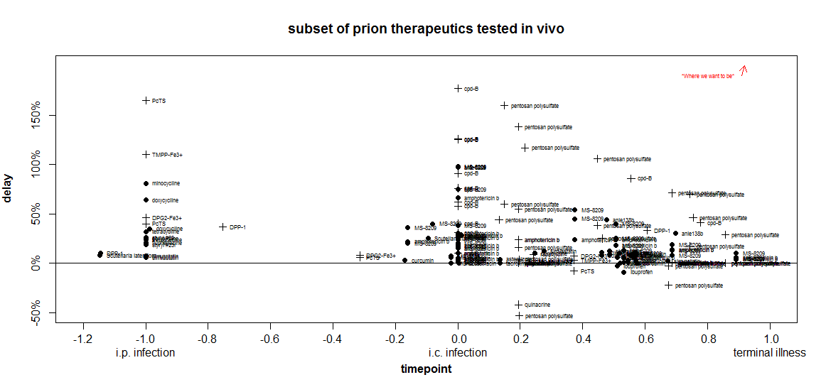
Crude though the comparison is, I still find it highly illuminating. When I was first getting into reading these studies and didn’t know what to look for yet, it seemed to me that the tetracyclines were quite promising since they gave delays of 25-81%. Other scientists I talked to were skeptical, but no one could give me a clear answer as to why they thought tetracyclines didn’t look promising.
Despite all atrocious simplifications that went into this plot, these two dimensions nevertheless manage to convey at least three important facts about the tetracyclines:
- At the timepoint they were tested in Luigi 2008 (-1.0 = zero days after peripheral infection), they are not the most effective drug. (PcTS & TMPP-Fe3+ are more effective).
- Other drugs have had equally large relative delays (81%) at much later timepoints (cpd-B, pentosan polysulfate and the polyenes amphotericin B & MS-8209).
- The only tetracycline that’s been tested at a later timepoint – minocycline [Riemer 2008 (ft)] at time 0.57- had no effect (its label is lost in a cloud of other ineffective drugs), while other drugs tested at that timepoint did have effects.
Of course, doxycycline has gained attention in part because it’s a relatively safe drug that can be taken orally and is already an approved drug. That’s more than can be said for most of the compounds on this plot. One of my interests is in evaluating which approved drugs and legally available herbal compounds might merit further study. So I plotted just that subset of compounds (note the y axis now goes from 0 to 30% instead of 200%):
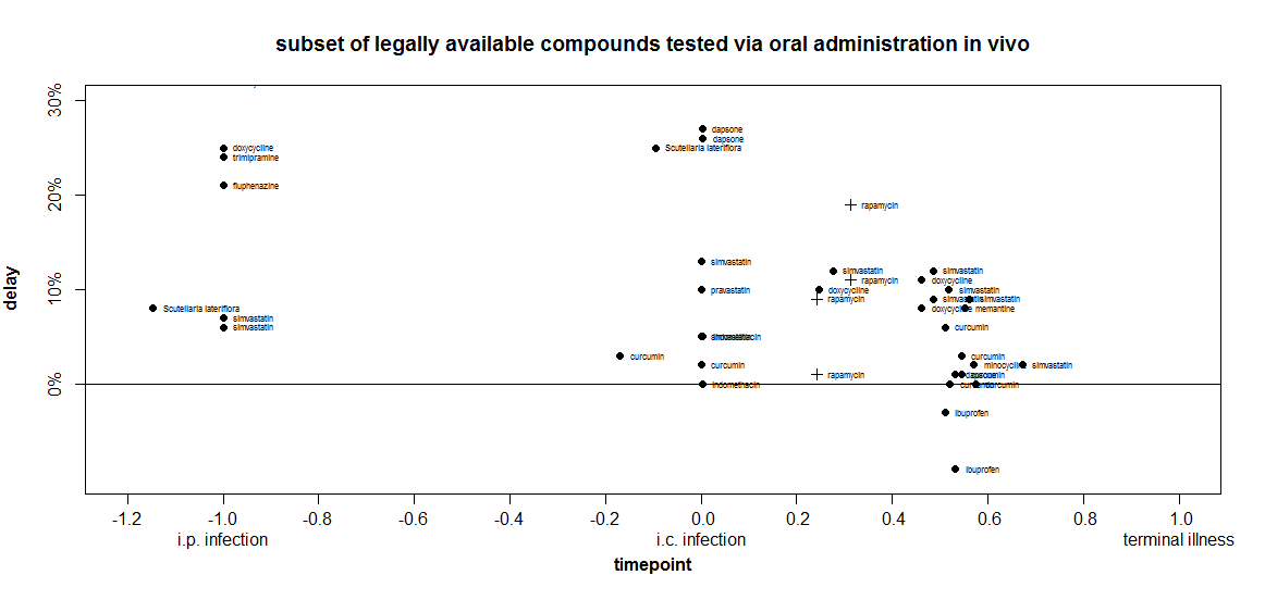
At time -1, doxycycline’s delay is indeed larger than anything else I’ve included in this plot This is not yet an exhaustive systematic review, just the things I happen to have already covered on this blog. Interestingly, around time 0, two other compounds are almost as effective: dapsone (a result which has failed replication) and Scutellaria lateriflora (which, as an herbal, is not regulated for active ingredient content and has also been associated with liver toxicity).
When I went to make this plot, I set the inclusion criteria as treament_route == 'oral' and found that doxycycline didn’t show up. I’d forgotten - Luigi 2008 had administered the drug via peripheral injection. So I added it back in manually for comparison purposes. In so doing, I inadvertently also included Luigi’s experiments where animals were infected intracerebrally and then treated with liposome-bound doxycycline directly injected into the brain. For those experiments at later timepoints, statins gave just slightly larger extensions of life in animals.
This seems a prudent time to remind the audience that I’m not an MD and nothing I say on this blog is medical advice. Again, I consider plots like the above one useful in thinking about which drugs, if any, should be prioritized for further study.
other limitations
In addition to their above-disclaimed shortcomings, here are some other important things that these timepoint-delay plots fail to capture:
- dosage
- treatment duration
- robustness to different prion strains*
This last point is especially important of the 2-aminothiazole reveal at Prion2013. For instance, cpd-B appears really strong on timepoint-delay plots, but only because the experiments where it was effective stand out while the experiments against other prion strains where it was ineffective get buried in a pile of other people’s unsuccessful experiments.
More broadly, the plots don’t do a great job of conveying the replicability of a result. They do sort of convey it – for instance, the statins look good on the last plot because they appear over and over. But a problem with both doxycycline and Scutellaria lateriflora on that plot is that they are both represented by results from just one paper each [Luigi 2008, Eiden 2012 respectively].
but hey, they’re still useful
In spite of all these limitations, these timepoint-delay plots offer an (to my knowledge, the first) objective way to compare results across these in vivo studies that have used very different animal models. These plots can at least serve as a first pass for seeing how results stack up, with disclaimers to be added as needed.
next steps
In order to create these plots, I first aggregated the data from every survival experiment in papers I’ve reviewed on this blog, attempting to capture all the dimensions on which they differ in one giant table. The table captures a lot of details that the plots don’t capture, and I want to provide this table and associated scripts as a resource to the community. I welcome other ideas of how to use this data to make helpful comparisons.
These are all works in progress. Update: latest versions will be kept in the new Prion Therapeutic Review section of the site. My goal over the next couple of months is to expand this from the current piecemeal effort to exhaustively include every in vivo survival study published for prion therapeutics. As such it will include many other small molecules I have missed so far, as well as immunotherapy and gene therapy efforts, which aren’t included yet.
Then my plan is to make this data freely available on CureFFI.org and keep it up to date indefinitely. I figure, the trouble with review articles is, they’re out of date as soon as they’re published. What’s more useful is a constantly up-to-date resource in a format ready for analysis. Of course, you also need a peer-reviewed citation you can cite in the intro to a paper instead of having to do your own (inevitably non-exhaustive) review in the introductory paragraphs. For that reason, once my database of published experiments is complete enough, hopefully later this summer, I’ll aim to publish a review article providing summary and analysis as well as introducing a new online resource.
In the meantime, I hope this data and these ideas will be useful to others and will stimulate discussion.

About Eric Vallabh Minikel
Eric Vallabh Minikel is on a lifelong quest to prevent prion disease. He is a scientist based at the Broad Institute of MIT and Harvard.